FarGo – Visual identity to celebrate the creative village’s 10th anniversary.
Visual Identity
Creative Direction
Environmental Design
Social Content
Advertising + Marketing
Print + Publication
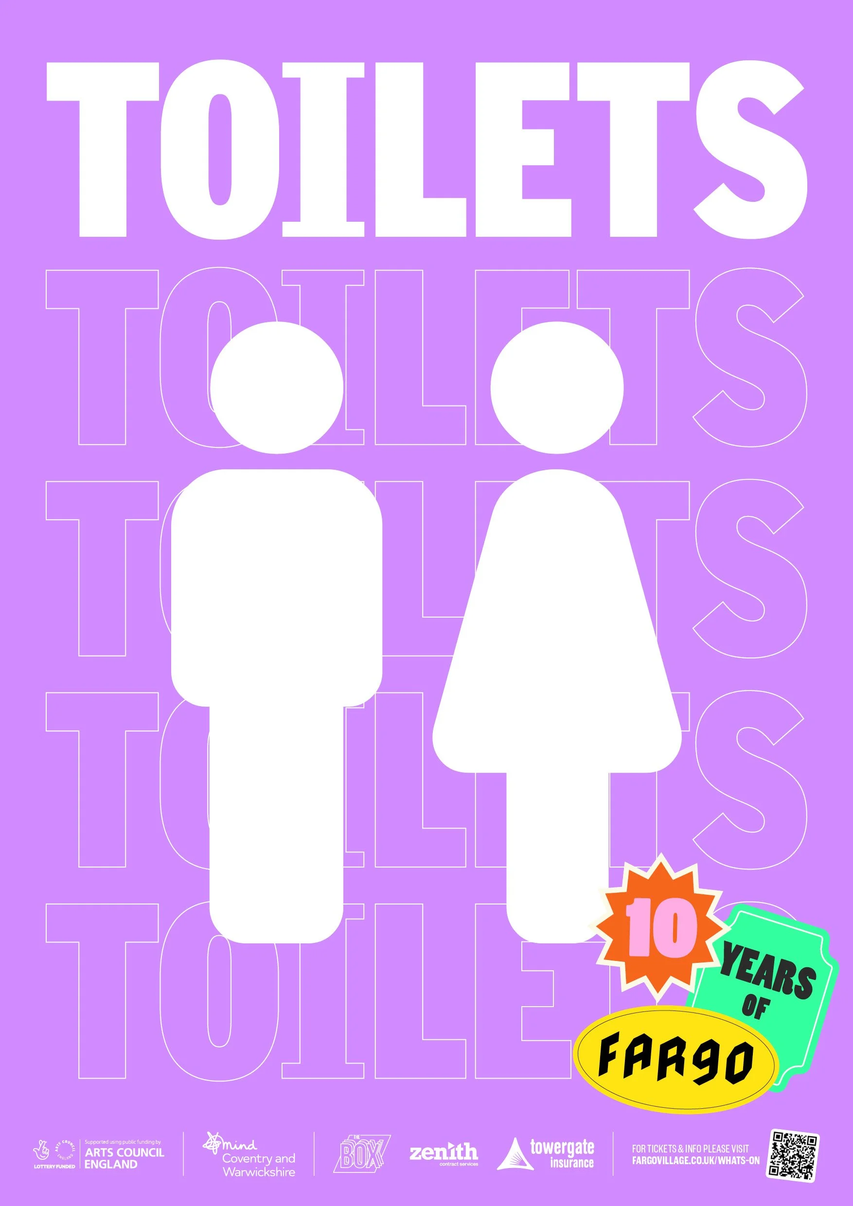
Way-finding + Signage
Services
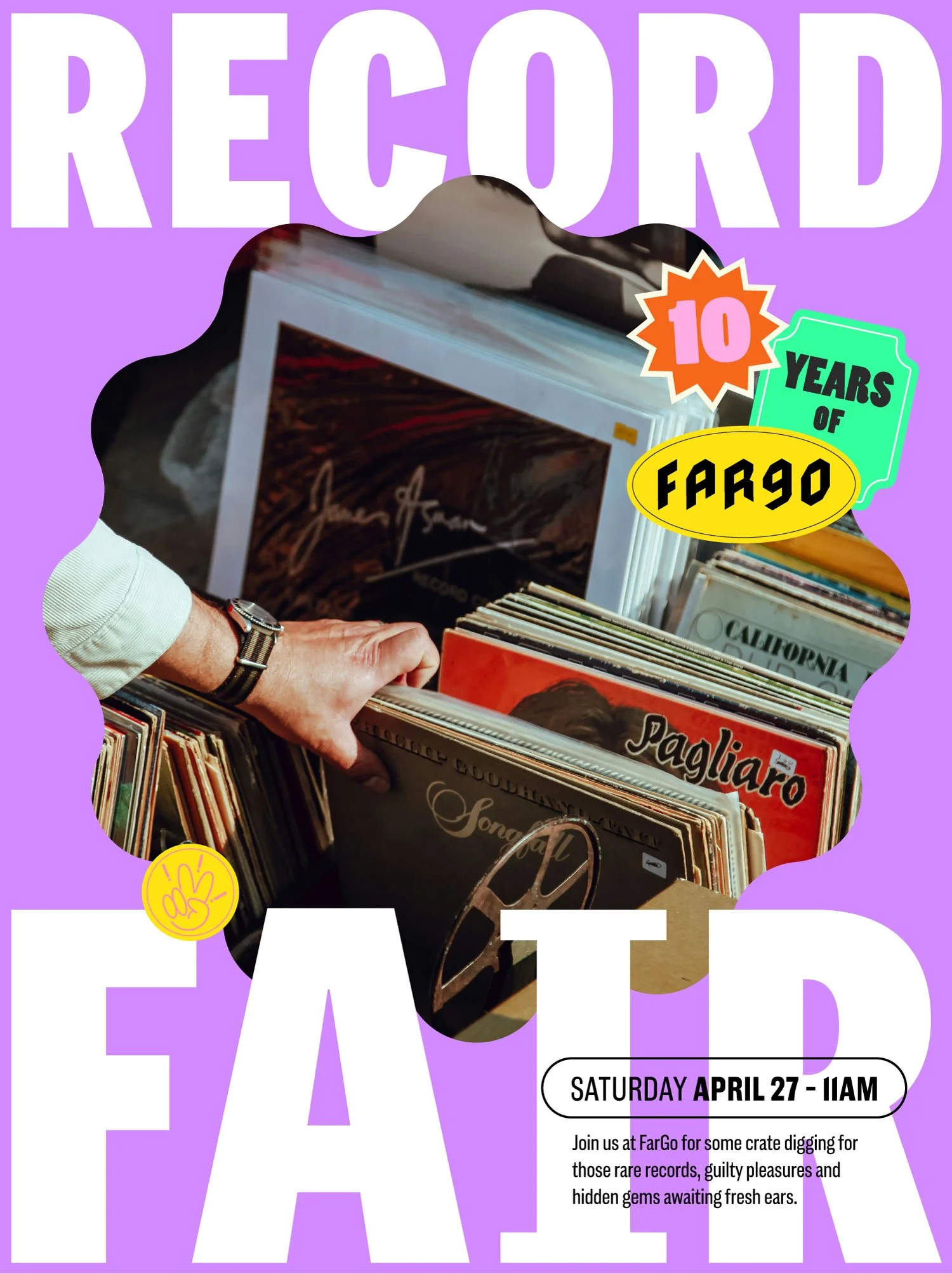
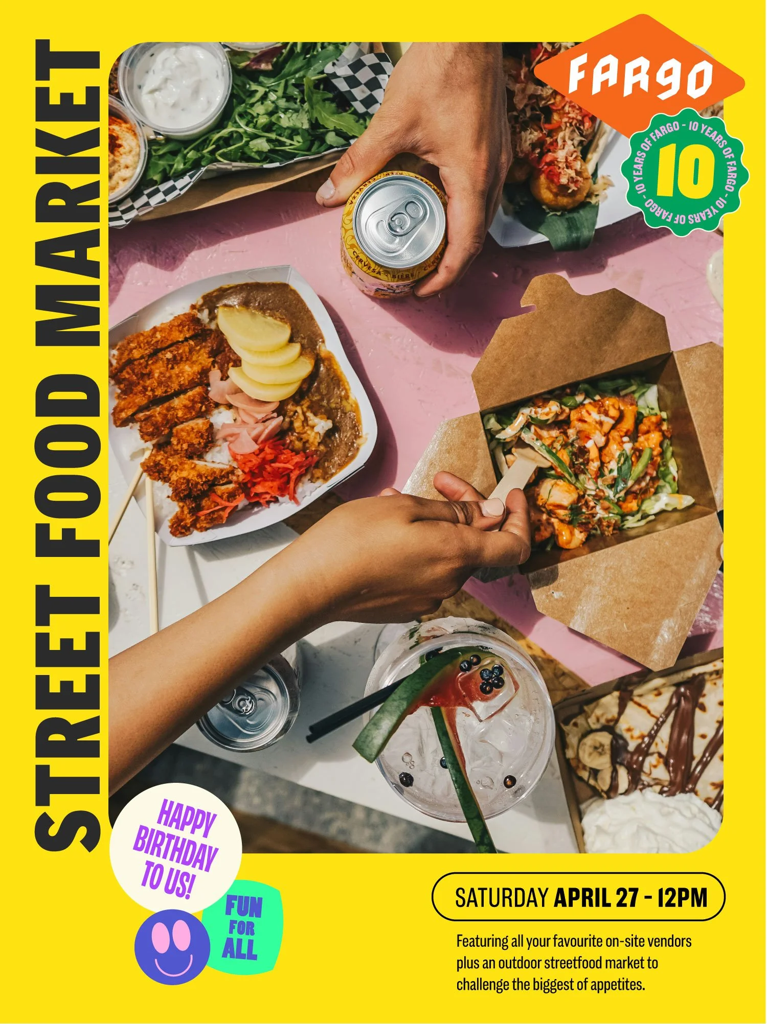
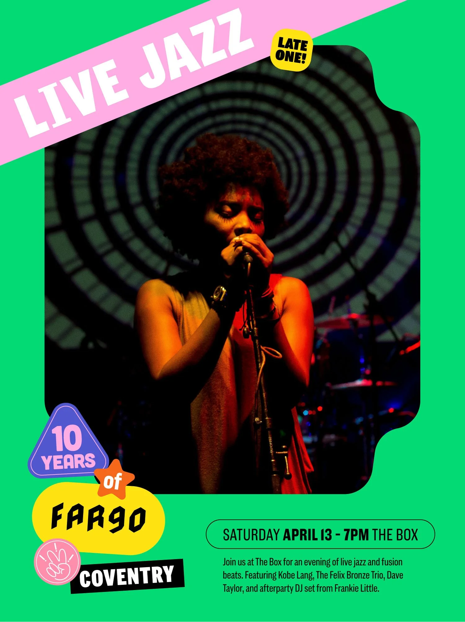
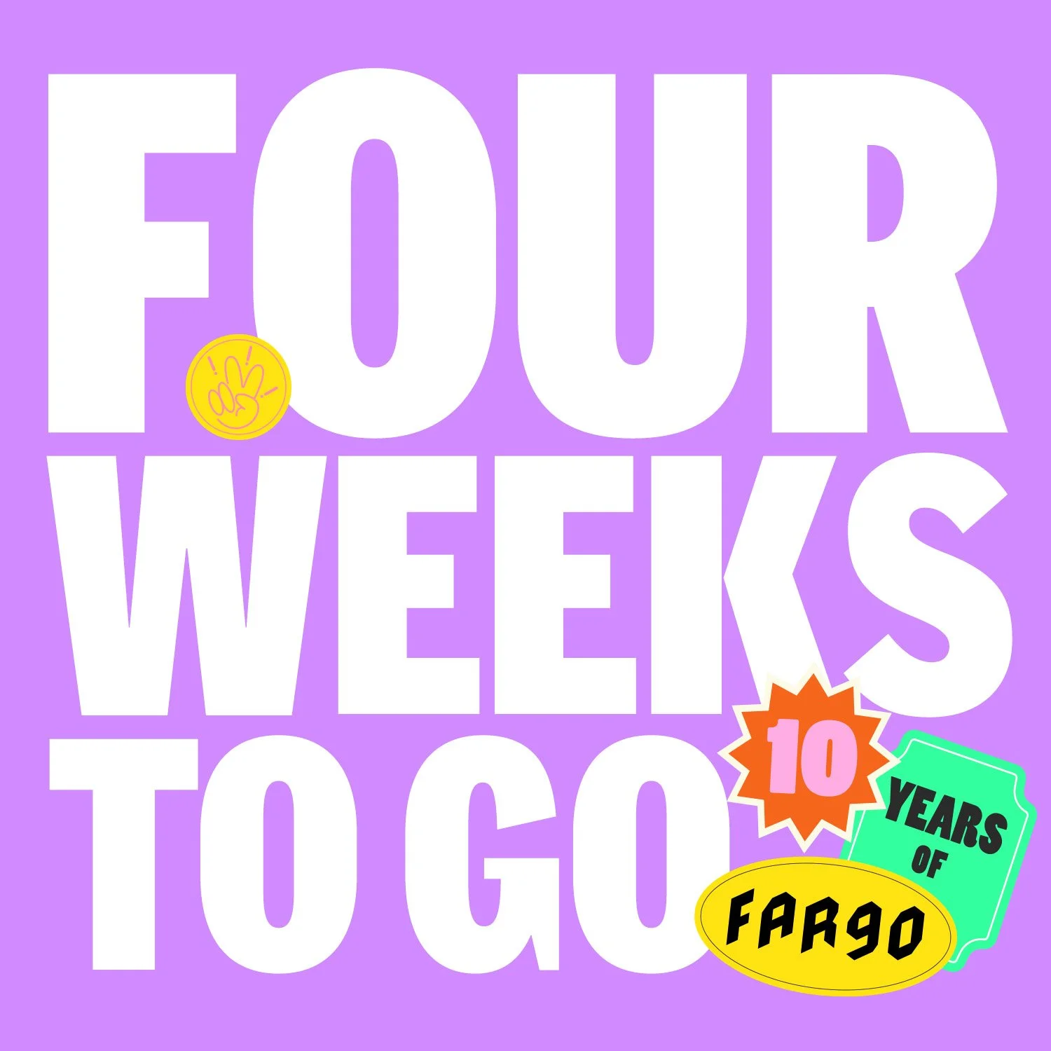
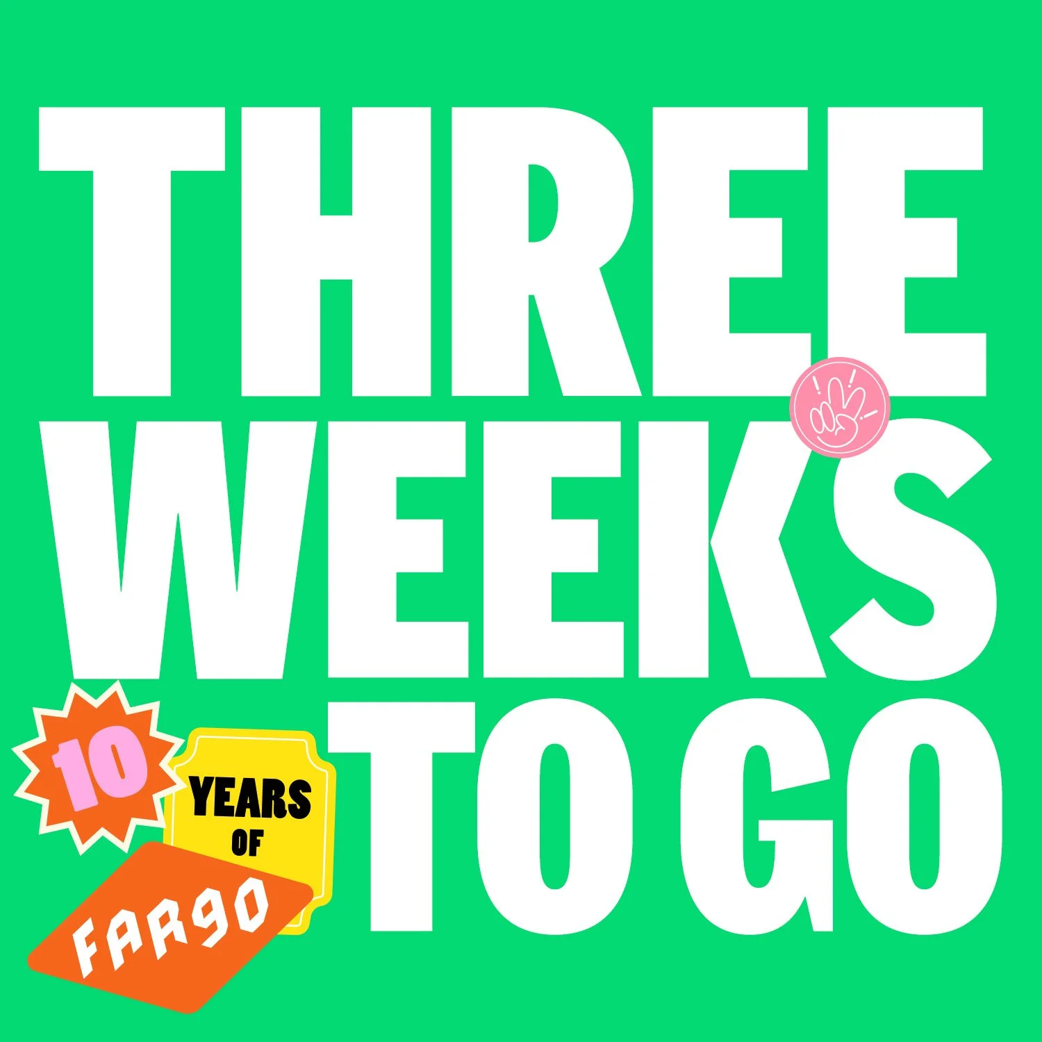
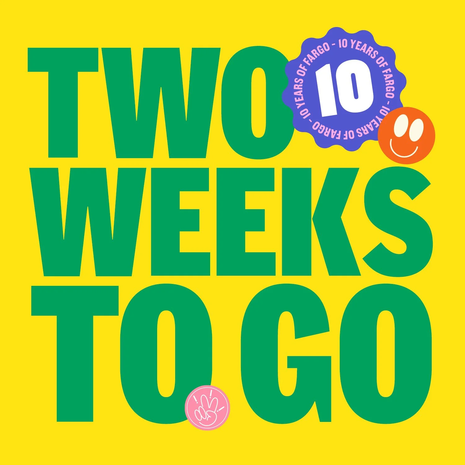
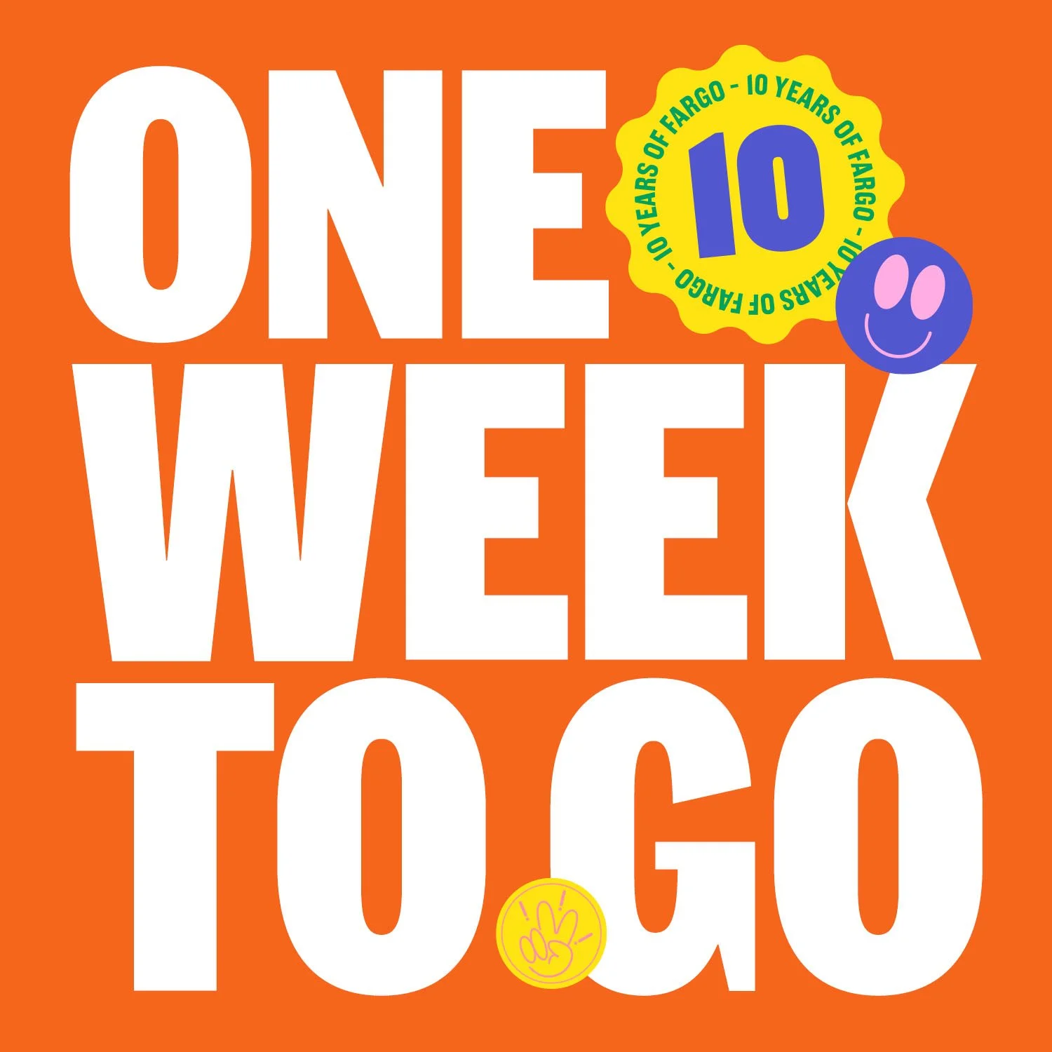
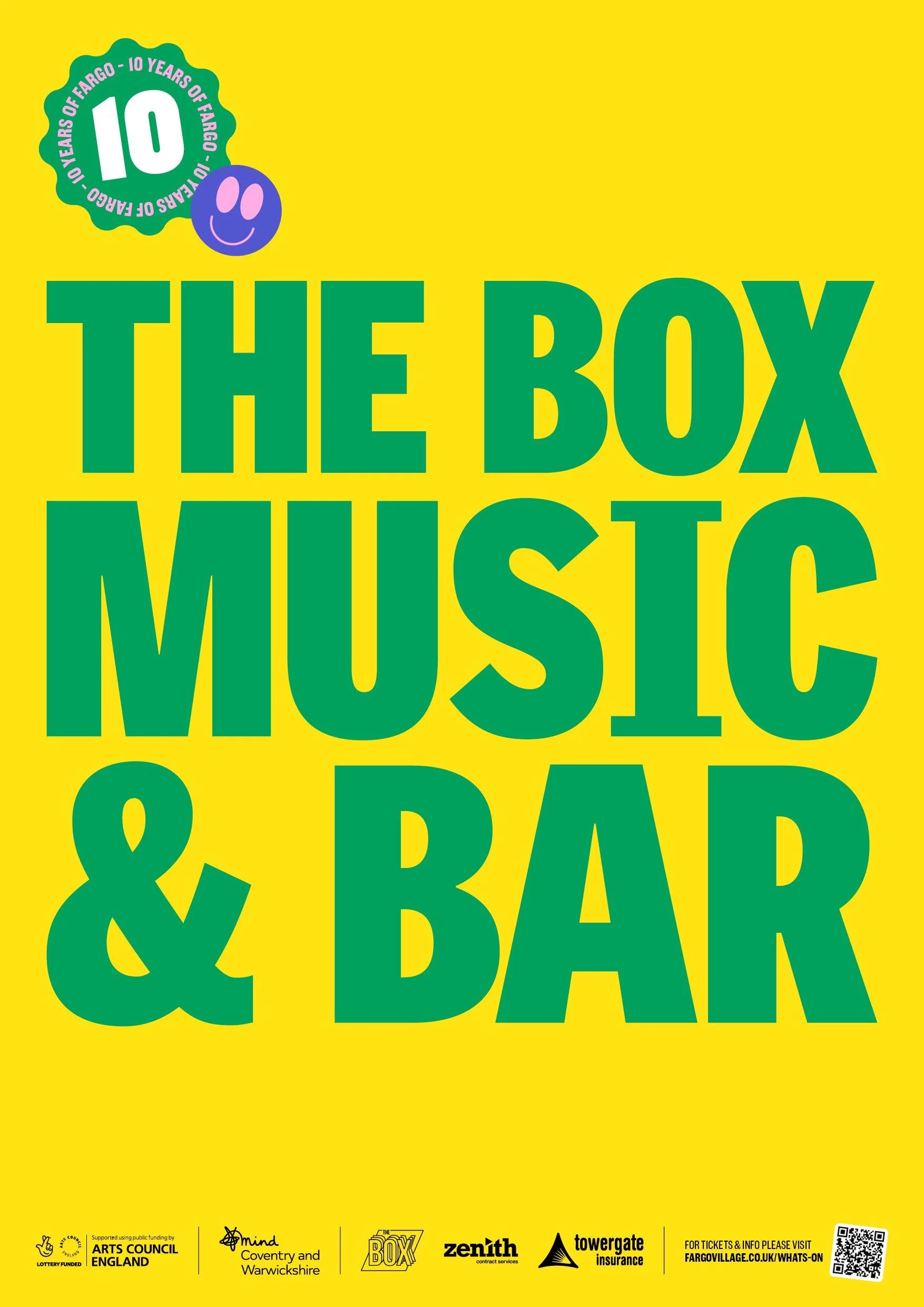
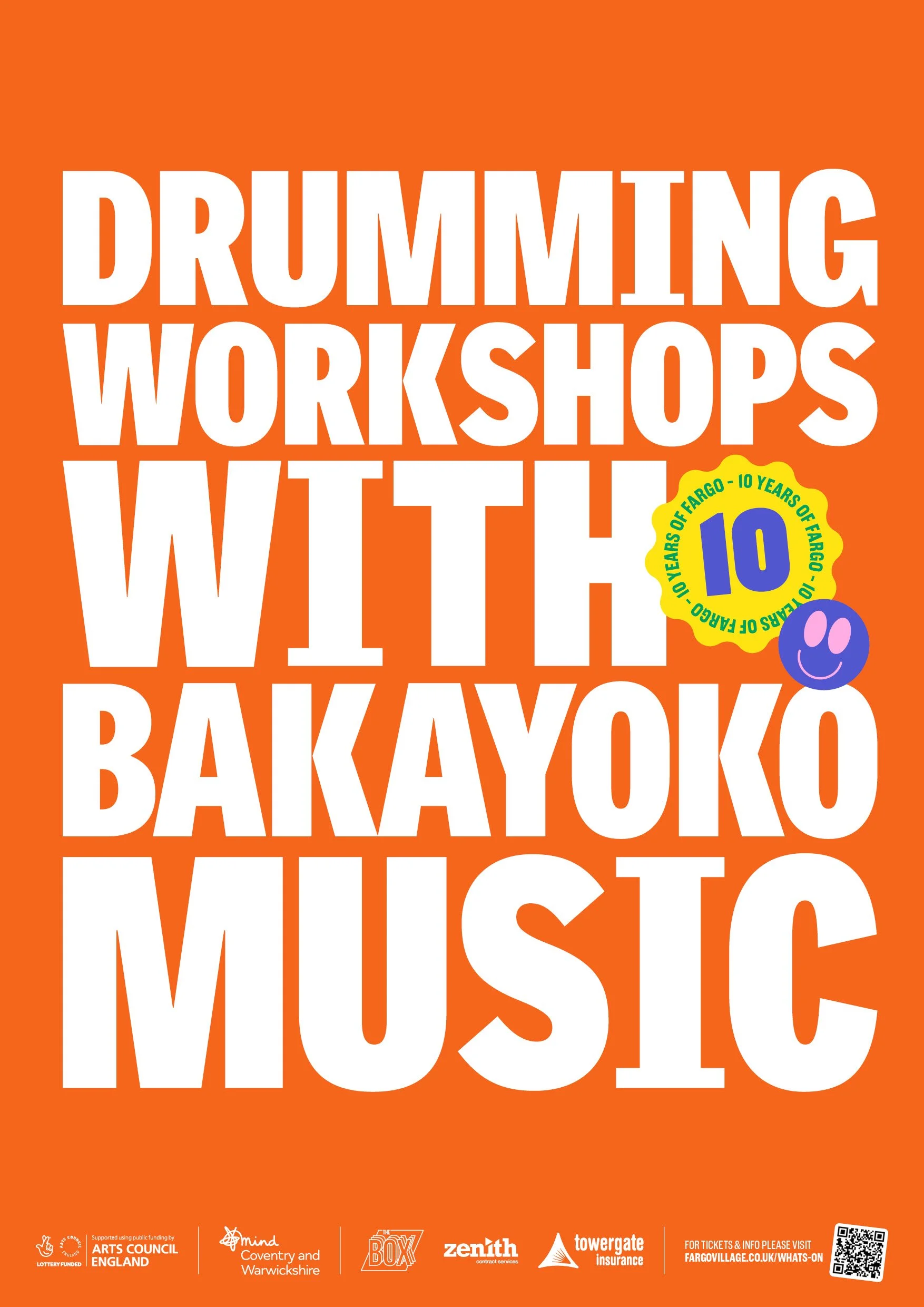
As FarGo prepared to celebrate their 10th anniversary they invited me to design them a unique identity for the event that celebrates their diversity, creative community and many events. Through my ongoing collaborative work with FarGo Village I already had a strong understanding of their current branding, having helped to refine and develop it. The brief was pretty open but it had to be bright, colourful and have a festival atmosphere.
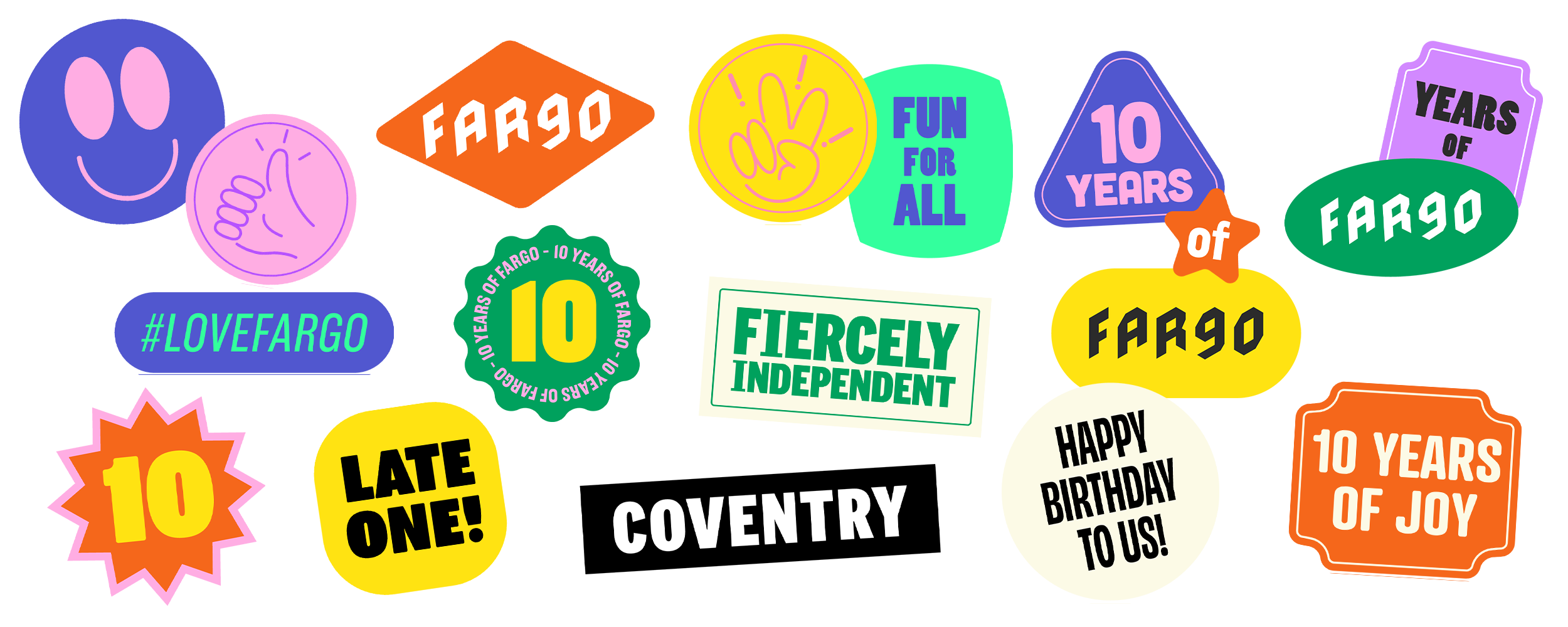
I developed a branding system that took the bright colour palette that I created for their master brand and turned it up to ten, a bank of fluid shaped holding devices with a lot smooth curves to convey a family friendly feel, and topped it off with a set of stickers that can be customised to support the message behind each piece of communication.
The branding was so well received by the community that we decided to take elements from it and utilised them to evolve the master brand. FarGo is a brand that doesn’t stand still or follow usual conventions, it’s bold and evolves with the seasons and its broad community and cultural events. It’s always a delight to produce creative with such a positive effect in the community.